
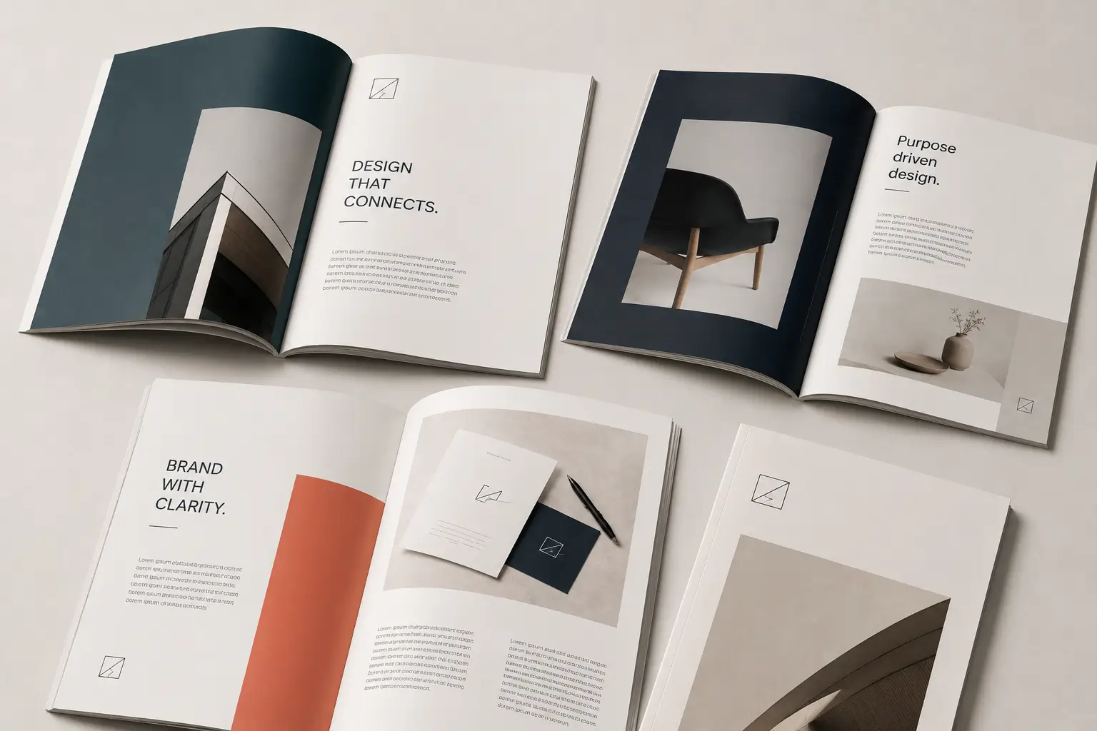
In the realm of design, layout serves as the backbone of visual communication, guiding the audience’s eye and shaping their experience. You may not realise it, but every time you engage with a piece of design—be it a website, a magazine, or a poster—your eyes are being led on a journey. The importance of layout design lies in its ability to create a coherent narrative that captures attention and conveys information effectively. Understanding how to manipulate layout principles can significantly enhance your ability to communicate ideas and evoke emotions through visual means.
As you delve deeper into the world of layout design, you’ll discover several key principles that influence its effectiveness. These principles include balance, hierarchy, proximity, contrast, typography, and the use of white space. Each of these elements plays a crucial role in how information is presented and perceived. By mastering these principles, you can create layouts that not only attract attention but also facilitate understanding and engagement. This article will explore these fundamental concepts in detail, providing you with insights that can elevate your design skills.
Balance and Symmetry
Balance and symmetry are foundational concepts in layout design that contribute significantly to visual appeal. When you think about balance, consider it as the distribution of visual weight within a composition. A well-balanced layout feels stable and harmonious, drawing the viewer in without overwhelming them. Symmetry, on the other hand, involves mirroring elements on either side of a central axis, creating a sense of order and predictability. You might find that symmetrical designs often evoke feelings of calmness and reliability, making them particularly effective for certain types of content.
However, balance does not always have to be symmetrical. Asymmetrical balance can also create dynamic and interesting layouts that engage the viewer’s eye in different ways. By strategically placing elements of varying sizes and weights, you can achieve a sense of equilibrium while maintaining visual interest. This approach encourages the audience to explore the design more thoroughly, guiding their gaze across the entire composition. Ultimately, whether you choose symmetry or asymmetry, understanding how to create balance will enhance your ability to craft visually appealing layouts.
Hierarchy and Emphasis
Hierarchy and emphasis are critical components in directing the viewer’s attention within a layout. Hierarchy refers to the arrangement of elements in a way that signifies their importance. By establishing a clear hierarchy, you can guide the audience’s eye to the most crucial information first. This can be achieved through size, colour, contrast, or placement. For instance, larger text or bolder colours naturally draw more attention than smaller or lighter elements. As you design, consider how you can manipulate these factors to create a clear path for your audience’s gaze.
Emphasis works hand-in-hand with hierarchy by highlighting specific elements that you want to stand out. This could be a call-to-action button on a website or an important statistic in an infographic. By using techniques such as contrasting colours or unique typography, you can make these elements pop against the rest of the layout. For example, if you’re designing a promotional flyer, placing a bright red box around your special offer will immediately catch the reader’s eye. By thoughtfully applying hierarchy and emphasis, you can ensure that your audience absorbs the most important information without confusion.
Proximity and Alignment
Proximity and alignment are two principles that significantly impact the flow of information within a layout. Proximity refers to how closely related elements are placed together; when items are grouped logically, it helps convey their relationship to one another. For instance, if you’re designing a brochure with various sections, placing related text and images close together will help your audience understand that they belong to the same category. This not only aids comprehension but also creates a cleaner and more organised appearance.
Alignment is equally important as it establishes a visual connection between elements in your design. When items are aligned—whether left, right, centre, or justified—they create a sense of order and professionalism. Misaligned elements can lead to confusion and disrupt the viewer’s experience. You might find that using grids or guides in your design software can help maintain consistent alignment throughout your layout. By effectively utilising proximity and alignment, you can create a seamless flow of information that guides your audience’s eye effortlessly through your design.
Contrast and Colour
The use of contrast and colour is vital in drawing attention to specific elements within a layout. Contrast refers to the difference between two or more elements—this could be in terms of colour, size, shape, or texture. High contrast can make certain features stand out dramatically, while low contrast may cause elements to blend together. As you design, think about how you can use contrast strategically to highlight key information or create visual interest.
Colour plays an essential role in this process as well. Different colours evoke different emotions and responses; for example, red often signifies urgency or excitement, while blue tends to convey calmness and trustworthiness. By selecting colours that align with your message and using them in contrast with one another, you can effectively guide your audience’s eye towards focal points in your layout. Consider creating a colour palette that complements your overall design while ensuring that important elements remain prominent through thoughtful application of contrast.
Typography and Readability
Typography is another crucial aspect of layout design that directly influences readability and audience engagement. The choice of typeface can set the tone for your entire design; for instance, serif fonts often convey tradition and reliability, while sans-serif fonts tend to feel modern and clean. As you select typography for your layout, consider not only the aesthetic appeal but also how easily your audience can read the text. Legibility is paramount; if viewers struggle to decipher your message due to poor font choices or sizes, they may disengage entirely.
Moreover, typography can also guide the movement of the audience’s eye through your design. By varying font sizes and weights—using larger headings for titles and smaller text for body copy—you create a natural hierarchy that directs attention where it needs to go. Additionally, line spacing and letter spacing can affect readability; too tight or too loose spacing can hinder comprehension. As you experiment with typography in your layouts, keep in mind how these choices influence both readability and visual flow.
White Space and Margins
White space—often referred to as negative space—is an essential element in creating effective layouts. It refers to the areas of a design that are left unmarked or empty; far from being wasted space, white space plays a critical role in enhancing clarity and focus within your composition. By incorporating sufficient white space around elements, you allow them to breathe and stand out more prominently. This not only improves aesthetics but also aids in guiding the viewer’s eye along a clear visual path.
Margins are another aspect of white space that should not be overlooked. They provide breathing room around the edges of your layout and help frame your content effectively. When margins are too narrow or inconsistent, it can lead to a cluttered appearance that distracts from the main message. To create an engaging layout, aim for balanced margins that complement your overall design while ensuring that key elements remain easily accessible to the viewer’s eye.
Conclusion and Application
In summary, understanding layout design principles is essential for guiding the audience’s eye effectively through any visual communication piece. By mastering concepts such as balance, hierarchy, proximity, contrast, typography, and white space, you can create layouts that not only capture attention but also facilitate comprehension and engagement. Each principle plays a unique role in shaping how information is presented and perceived by viewers.
As you apply these principles in your own designs, remember to experiment and iterate on your ideas. Consider how each element interacts with others within your layout and strive for harmony between them all. With practice and attention to detail, you’ll find yourself creating layouts that resonate with audiences while effectively conveying your intended message. Embrace these principles as tools in your design arsenal; they will serve you well as you embark on your creative journey.