
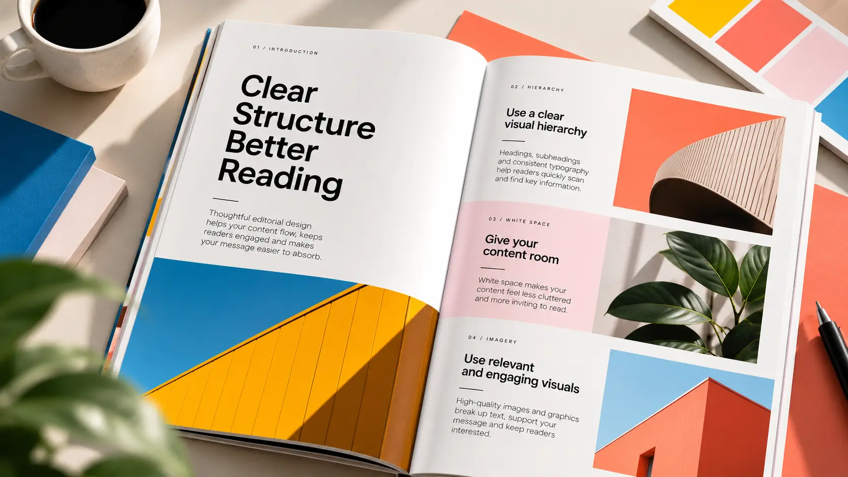
When you delve into the world of editorial design, you are stepping into a realm where visual aesthetics and textual content converge to create a cohesive narrative. Editorial design encompasses the layout and presentation of printed materials such as magazines, newspapers, and books, as well as digital publications. It is not merely about making things look attractive; it is about crafting an experience that guides the reader through the content seamlessly. As you explore this field, you will discover that every element, from typography to imagery, plays a crucial role in conveying the intended message.
In essence, editorial design is a form of communication that utilises visual language to enhance the written word. You might find yourself considering how various design choices can influence a reader’s perception and understanding of the content. The interplay between text and visuals can evoke emotions, highlight key messages, and ultimately shape the reader’s journey through the material. As you engage with editorial design, you will learn to appreciate the delicate balance between creativity and functionality, ensuring that your designs not only captivate but also inform.
The Importance of Readability in Editorial Content
Readability is paramount in editorial content, as it directly affects how easily your audience can consume and comprehend the information presented. When you design a publication, your primary goal should be to facilitate understanding. If readers struggle to decipher the text due to poor layout or font choices, they are likely to disengage and miss out on the valuable insights you aim to share. Therefore, prioritising readability is essential for maintaining your audience’s interest and ensuring that your message resonates.
To enhance readability, you must consider various factors such as font size, line spacing, and contrast between text and background. You may find that a well-chosen typeface can significantly improve legibility, while appropriate line lengths can prevent reader fatigue. Additionally, incorporating headings and subheadings can help break up large blocks of text, guiding readers through the content in a more digestible manner. By focusing on these elements, you create an inviting reading experience that encourages your audience to engage with your material fully.
Key Principles of Editorial Design Layout
As you embark on your journey into editorial design, familiarising yourself with key principles of layout will serve as a solid foundation for your work. One of the most critical aspects is alignment; ensuring that elements are properly aligned creates a sense of order and professionalism. When you align text and images thoughtfully, you guide the reader’s eye naturally across the page, making it easier for them to absorb information.
Another principle to consider is balance. Striking a harmonious balance between text and visuals is essential for creating an aesthetically pleasing layout. You might experiment with asymmetrical designs that draw attention while maintaining equilibrium or opt for symmetrical layouts that exude stability and structure. Additionally, consistency in design elements such as colour schemes and typography will help reinforce your brand identity and create a cohesive look throughout your publication. By mastering these principles, you will be well-equipped to create layouts that not only look good but also enhance the overall reading experience.
Typography Choices: Enhancing Clarity and Engagement
Typography is one of the most powerful tools at your disposal in editorial design. The choice of typeface can significantly impact how your content is perceived and understood. When selecting fonts, consider their legibility at various sizes and weights. You may find that sans-serif fonts offer a modern feel and are easier to read on screens, while serif fonts can lend a sense of tradition and authority to printed materials. By carefully choosing your typography, you can enhance both clarity and engagement for your readers.
Moreover, combining different typefaces can create visual interest and hierarchy within your content. You might choose a bold typeface for headings to draw attention while using a more understated font for body text to ensure readability. However, it is crucial to limit the number of typefaces used in a single publication to maintain coherence. Striking the right balance between variety and consistency will keep your design engaging without overwhelming your audience. Ultimately, thoughtful typography choices will elevate your editorial design and foster a deeper connection with your readers.
Effective Use of White Space and Margins
White space, often referred to as negative space, is an essential component of effective editorial design. It refers to the areas of a page that are left unmarked or devoid of content. While it may seem counterintuitive to leave space empty, doing so can significantly enhance the overall readability and aesthetic appeal of your publication. By incorporating white space strategically, you allow your content to breathe, making it easier for readers to navigate through the material without feeling overwhelmed.
Margins also play a vital role in creating an inviting layout. Adequate margins not only frame your content but also provide breathing room for the reader’s eyes. When you set generous margins around text blocks and images, you create a sense of organisation that guides readers through the page effortlessly. Additionally, white space can be used to emphasise important elements or sections within your publication, drawing attention where it is needed most. By mastering the art of white space and margins, you will create designs that are both visually appealing and functional.
Incorporating Visual Elements to Support the Text
Visual elements are integral to editorial design as they serve to complement and enhance the written content. When you incorporate images, illustrations, infographics, or charts into your publication, you provide readers with additional context that can deepen their understanding of the subject matter. Visuals can break up large blocks of text, making the content more engaging and digestible while also adding an emotional layer to the narrative.
As you select visual elements for your design, consider their relevance to the accompanying text. Each image should serve a purpose—whether it’s illustrating a point, providing evidence, or evoking an emotional response. You might also explore different styles of visuals; for instance, photographs can convey realism while illustrations can add a whimsical touch. By thoughtfully integrating visual elements into your editorial design, you will create a richer reading experience that resonates with your audience on multiple levels.
Structuring Content with Hierarchy and Flow
Creating a clear hierarchy within your editorial design is essential for guiding readers through your content effectively. Hierarchy refers to the arrangement of elements in order of importance, allowing readers to navigate through information intuitively. When designing layouts, consider using varying font sizes, weights, and colours to establish a visual hierarchy that directs attention where it is needed most.
Flow is another critical aspect of structuring content effectively. You want to ensure that readers can move seamlessly from one section to another without confusion or disruption. This can be achieved by using consistent formatting for headings and subheadings while maintaining logical transitions between paragraphs. You might also employ visual cues such as arrows or lines to guide readers through complex information or multi-part articles. By prioritising hierarchy and flow in your editorial design, you will create an engaging reading experience that keeps your audience invested in the material.
Practical Tips for Optimising Editorial Design for Readers
As you refine your skills in editorial design, there are several practical tips you can implement to optimise your work for readers. First and foremost, always keep your target audience in mind when making design decisions. Understanding their preferences and expectations will help you tailor your designs accordingly, ensuring that they resonate with those who will be engaging with your content.
Additionally, consider conducting usability tests with real readers before finalising your designs. Gathering feedback on readability, layout, and overall engagement can provide invaluable insights that inform your revisions. You might also explore various design software tools that offer templates and resources specifically tailored for editorial design; these can streamline your workflow while ensuring professional results.
Finally, stay informed about current trends in editorial design by following industry publications or attending workshops and conferences. The world of design is ever-evolving, and being aware of new techniques or styles will keep your work fresh and relevant. By applying these practical tips alongside the principles discussed throughout this article, you will be well-equipped to create compelling editorial designs that captivate and inform your readers effectively.